
Video
How on-screen text is set, paced and timed in sudo videos — a reference for video production partners.
← Brand GuidelinesFrame
Frame · 1920 × 1080 · 16:9
Title safe · 120 px inset
All deliverables are 16:9. Masters are 3840 × 2160; every value in this guide is specified at 1920 × 1080 — scale 2× for UHD. Keep all text inside the 120 px title-safe area.
Delivery
Intro & Outro
The finished type-on stings for both marks. Sky · Yankees is the primary colorway; Indigo · White and Sky · Indigo follow. Use them as delivered — don't re-time, crop or recolor.
sudo
1920 × 1080 · 60 fps · 2 sBlack · White and White · Black are for overlaying on footage only — never as standalone cards. MP4 (H.264) drops straight into web pages and players; MOV (HEVC) is the higher-quality file for edit timelines.
Scenes
Four worked examples show the system — two title treatments, an intertitle and a lower third. The sample copy is illustrative and changes by project.
Building bothaus
The simplest opener after the logo sting: a single centered line of Display, typed on. No tagline — when one is needed, use the title card.
Introducing bothaus, from sudo
An open lab for robot developers
Opens the film after the logo. The title types on; the tagline holds a beat, then fades up beneath — two lines maximum.
#1
meet the robot
Intertitles between documentary acts. The index is fixed on the left — like the #, never typed; the short section title types on opposite it.
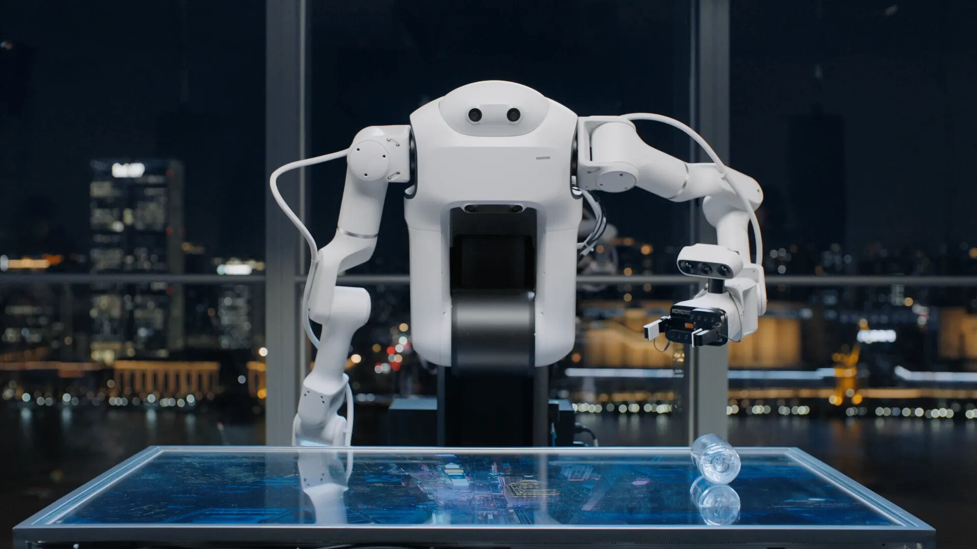
#1 Meet the robot
Intertitle text may sit over footage as a compact caption when a full card would break the pacing. Captions fade up over a Yankees gradient — never typed on.
Copy
Write for the edit: one idea per card, readable in one breath. These limits apply to the English master copy; approve a separate CJK type and line-length system before producing Chinese-language motion.
Title card
Primary
1–2 lines · ≤ 32 characters per line
Support / meta
Optional 1 line · ≤ 56 characters
Intertitle
Primary
2–4 words · 1 line
Support / meta
Fixed # + index · never typed
Lower third
Primary
1 line · ≤ 32 characters
Support / meta
Optional label · ≤ 24 characters
Closing lockup
Primary
Slogan · 1–2 lines · ≤ 36 characters
Support / meta
Date or URL · 1 line · ≤ 28 characters
- Use sentence case. Reserve all caps for Meta, where the template applies it automatically.
- Keep sudo and bothaus lowercase, including at the start of a line.
- Omit terminal punctuation on titles, intertitles and slogans.
- Write literal, specific lines; avoid stacked claims, hashtags and calls to action.
Typography
Introducing bothaus, from sudo
An open lab for robot developers
opening late 2026
Sizes at 1920 × 1080; scale proportionally. Poly and Semi never mix within a line — dates, URLs and labels are always Semi. GT Mechanik is the approved Latin system; CJK motion needs a separately approved companion face.
Rhythm & Speed
The pace is mechanical — characters land at a fixed interval, like a terminal, not a human typist. Never randomize the interval, never ease, and never animate anything except opacity.
Color
Yankees
Background
Sky
Text
Sky 60
Secondary
White
Logo
Full-frame cards set Sky type on a Yankees background; logos reverse to White. Secondary lines drop to 60 % opacity. Footage runs full frame — no other colors appear on cards.
Usage
Do
- ✓Open with the logo sequence; end on the closing lockup so the bookends rhyme.
- ✓Keep the type-on speed constant and the block cursor visible while typing.
- ✓Keep all text inside the 120 px title-safe area.
- ✓Set dates, URLs and labels in GT Mechanik Semi.
- ✓Hold finished cards at least 2 seconds.
Don't
- ✕Don't type the # — it's the prompt, on screen from frame one.
- ✕Don't ease, bounce or randomize the type-on.
- ✕Don't animate position, scale or tracking — opacity only.
- ✕Don't type on over footage — captions fade up as lower thirds.
- ✕Don't introduce new colors — type is always Sky, logos reverse to White.
- ✕Don't show two cursors at once, or leave one on a finished card — the logo intro and closing lockup are the only exceptions.
Need the source files?
For the alpha logo sequence, font files, or anything not covered here, reach out.